
Growing Better
A 3D animation that follows the journey of an ordinary office worker modelled, animated in Maya and Blender.
Photography VR
A Virtual-Reality Experience for those interested in photography created in Unity
Studio C - Collection of Games
These projects were created for IAT 312, Foundations of game design, in the Spring 24 semester at Simon Fraser University. Studio C was our group name which encompasses all three projects facilitated by senior lecturer Eric Yang and teaching assistant Morteza Malekmakan.
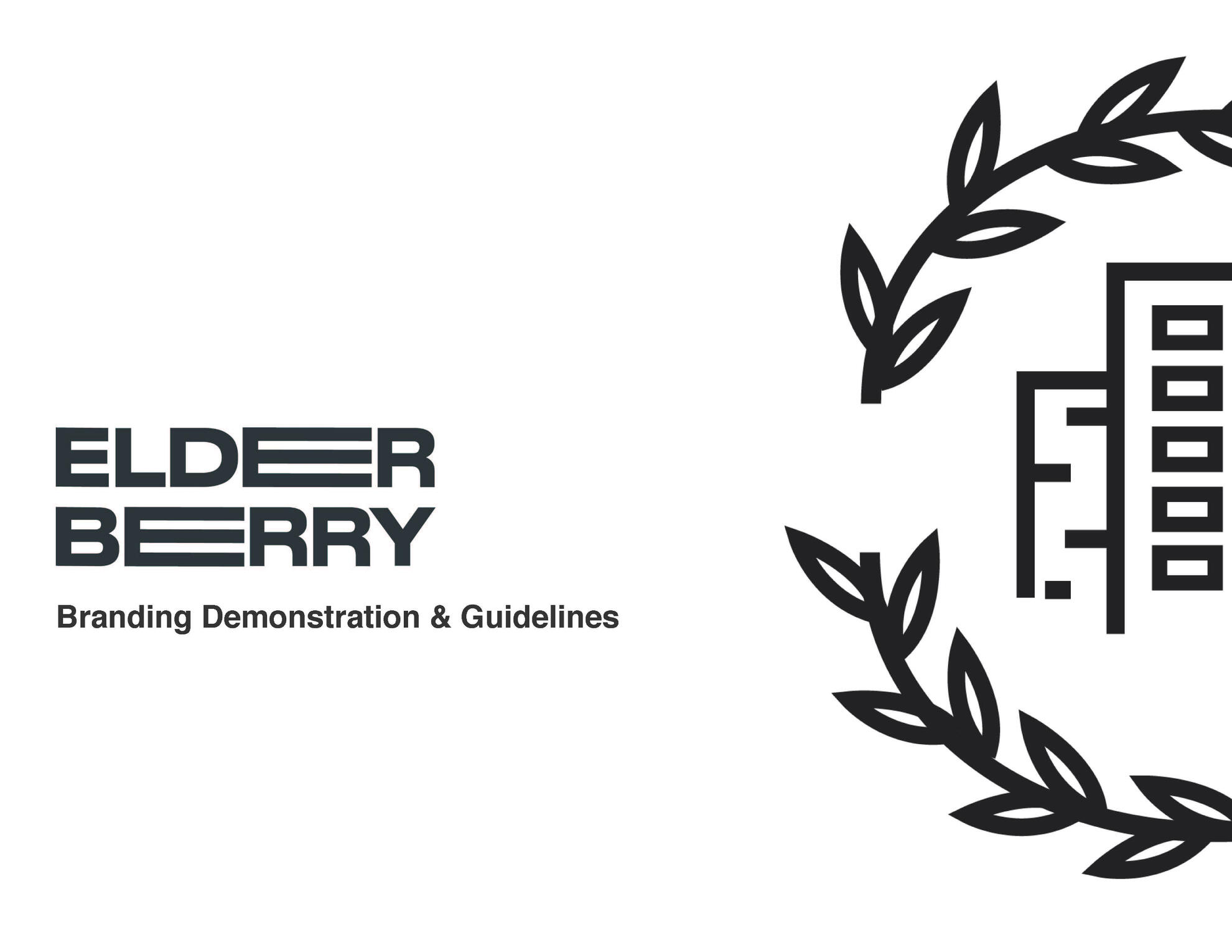
Elderberry
Brand mock up created with Figma, InDesign, and Illustrator.
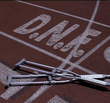
D.N.F.
Short Film: A nationally-recognized cross country runner struggling with a lack of direction in life after a career-ending injury must overcome their emotional trauma to come to the aid of another.
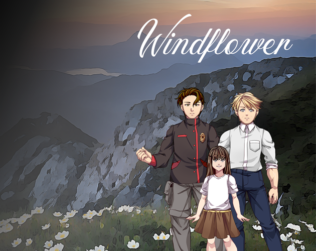
Windflower
An original multilinear narrative created in Ren'Py.
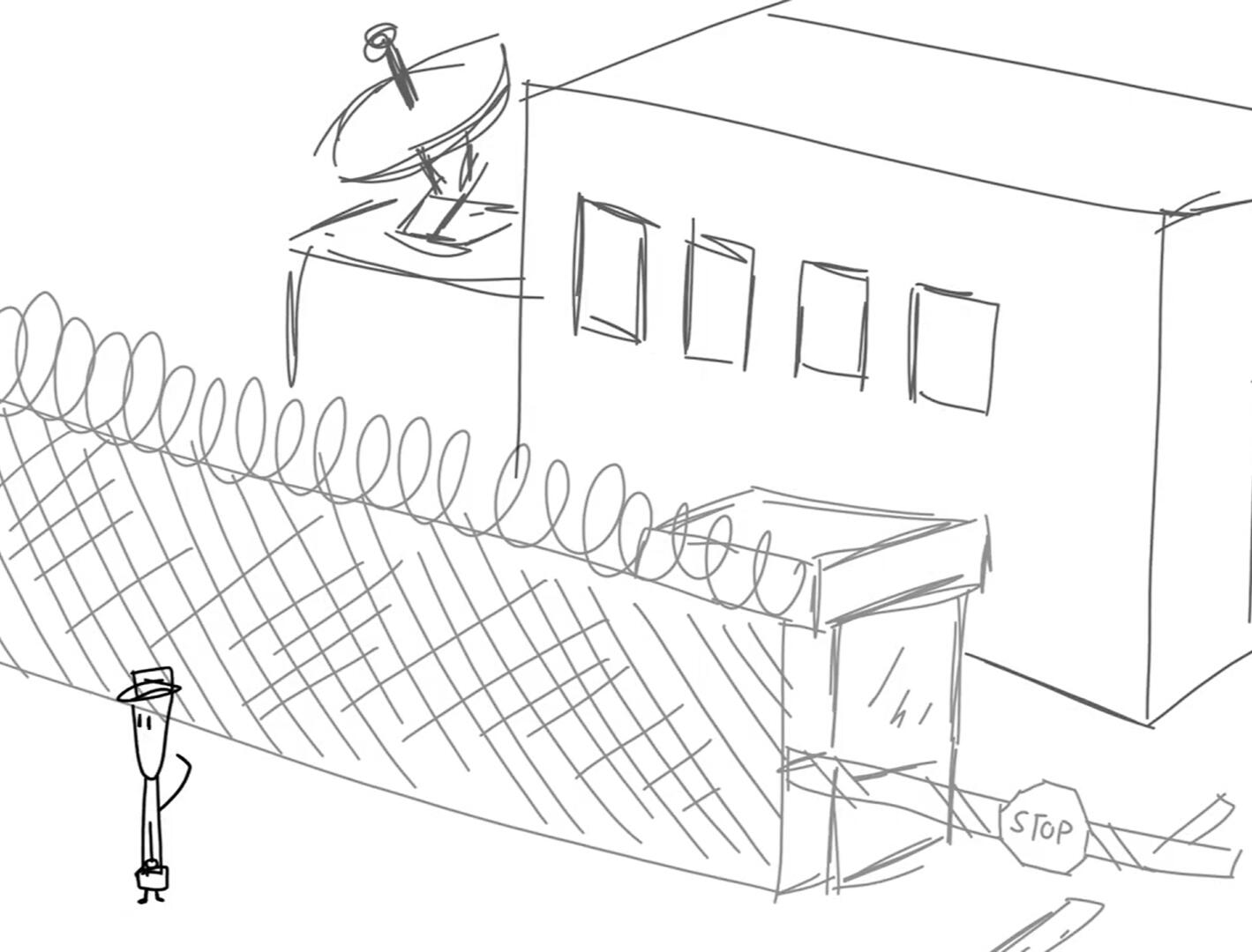
Hacking in Progress
A digitally hand-drawn 2D animation that follows the journey of a clumsy hacker and his attempt to infiltrate a secure facility, made in Adobe Animate.
Hi, I'm Andy, a Visual Artist
Current 5th-year university student working in education, IT, and events. Dependable, friendly, tech-savvy, and willing to learn. Knowledgeable in:
Visual Media
Python / Java
Motion Capture
About this project
Growing better is a 3D Animation about a lonely worker suffering through a monotonous daily schedule whose perspective was changed by the thoughtful actions of a coworker.
The animation was created by a group of six students for the course IAT343, a course on techniques for 3D computer animation such as keyframing, performance animation, procedural methods, motion capture, and simulation.
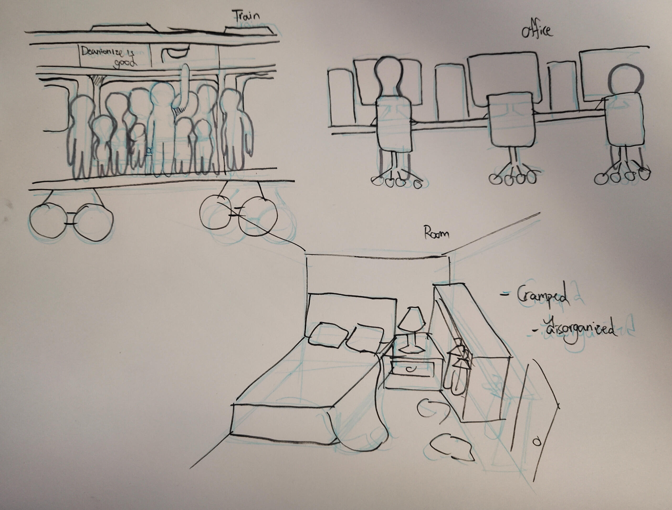
Fig. 1: Story environment design
Process
We were tasked to come up with a story pitch that would be turned into a 3-5 minute animation at the start of the course. My original idea included a depressed and overworked office worker/programmer as the protagonist. He ends up getting a plant from a co-worker. As he takes care of it, and it grows he becomes more social, and his happiness grows. I also wanted the film to change from black and white to full colour as the flower blooms at the end.
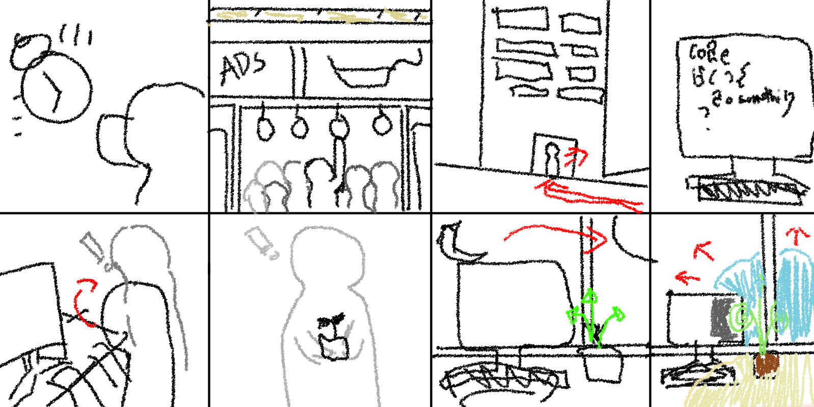
Fig. 2: Draft storyboard
After a vote to decide on whose story to do, we ended up deciding as a team to further develop my original idea, slightly changing the story flow and format, as well as fine-tuning some of the background details. I went back to my original storyboard and added more scenes to help with some of the flow issues the story had.
We created a document in Figma where we outlined a more detailed storyboard and posted our ideas for character and environment designs.
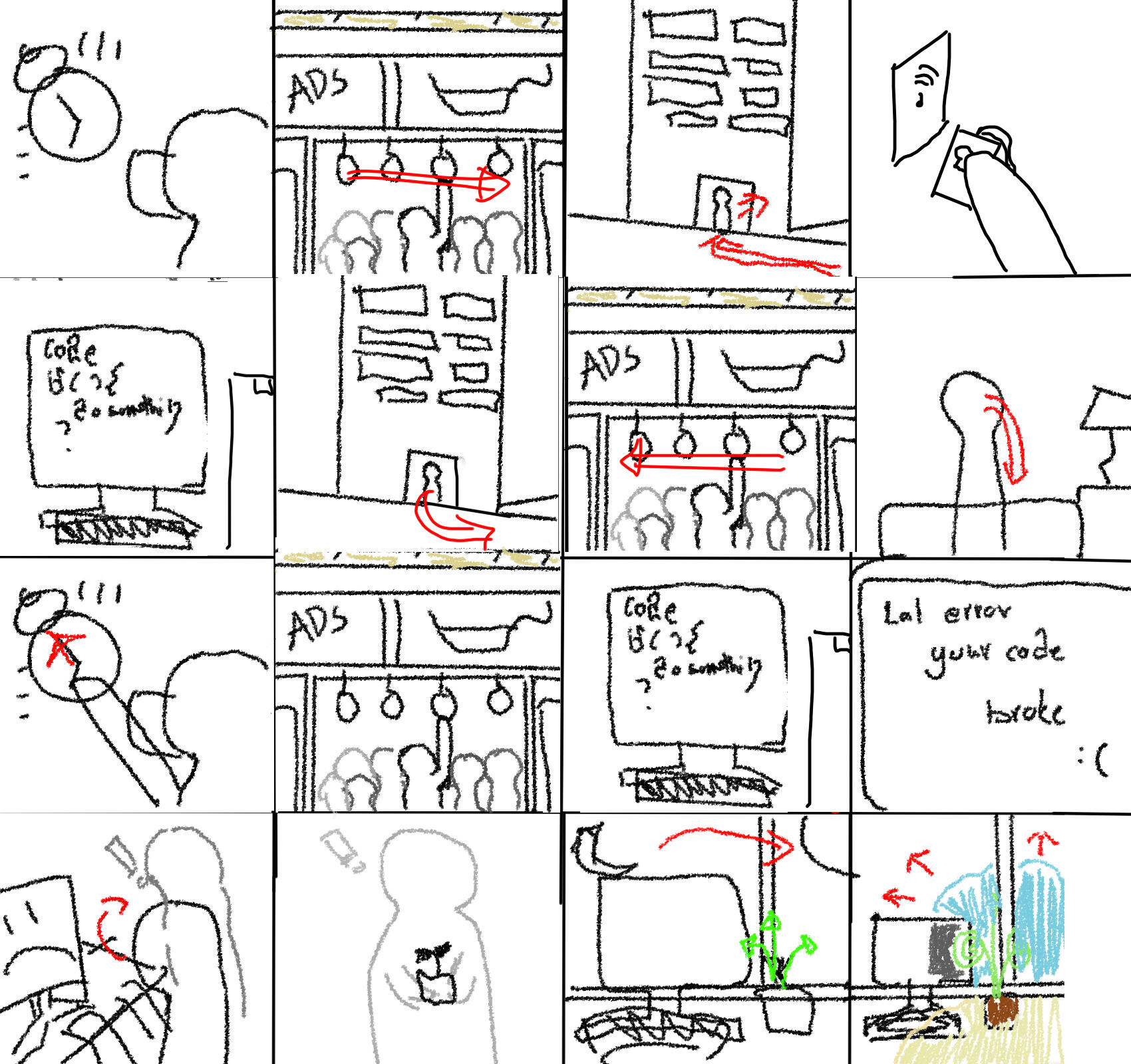
Fig. 3: Improved storyboard
I was also tasked with creating the website for our group and project. I used a design website called Carrd to build a simple yet effective site for our project without the need to create full-fledged HTML and CSS scripts. However, I did have to style certain elements that did not function as I would have expected them to.The project website can be seen here.
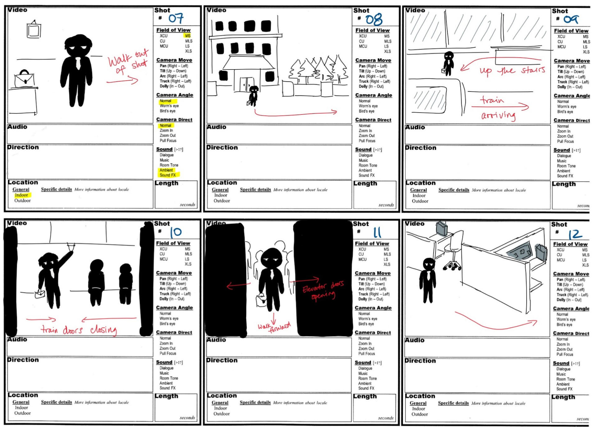
Fig. 4: Final Storyboard with stage direction
Once we finalized our concept, aesthetics, and project timeline, we had to create a narrated storyboard, which I helped organize and narrate. Having a well-organized and narrated storyboard helped our group a lot, as we were able to easily reference it when it came to modeling, animating, and composing the final film.
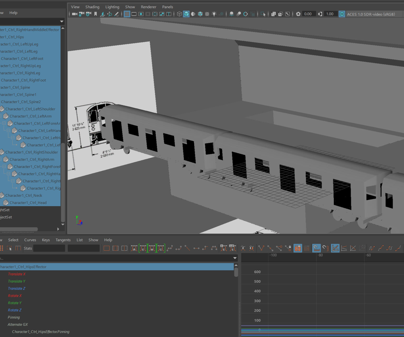
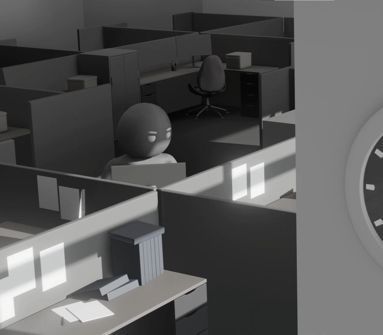
Fig. 5: Subway station modelled in Maya
After completing the narrated storyboard, we then had to start modelling our characters and scenes for use in an animatic: a roughly-animated version of the final animation using basic models, animations, and textures.
I was tasked with creating some of the models and scenes [Fig. 5], as well as rigging the preliminary model of the main protagonist. I also made a short animation for it [Fig. 6].
Fig. 6: Test animation for main characters w/ rigging
Fig. 7: Final animatic created in Maya and composited in Premier
My teammates and I created the models and animations based on our previous storyboarding and art, then sent the frames and animations to one of our teammates for compositing and sound design.See [Fig. 7] for the final animatic.
We received feedback from the teaching team on our animatic and improved our animations as well as character settings.Some of the feedback we received from our professor on the animatic was that the montage was too long, causing the viewer to lose interest. In the final animation, our team addressed this by shortening the montage and adding more variation between iterations, as well as improving the sound design by increasing the amount of repeating sounds used in the montage. For the final animation, we used Maya's lighting system and rendering engine to render the animation. However, we found that Maya is heavily CPU-bound and that rendering of our animation was taking longer than expected. Thus, we decided to switch over to Blender for rendering, as it is much more GPU optimized, and we were able to transfer our work without too much hassle.The final animation can be seen here
Conclusion
I think my biggest challenge with this project was working with such a large group of people. We struggled with syncing files and agreeing on ideas, but I think in the end we were able to create an exceptional project despite these setbacks. I was able to take leadership when deciding on story ideas, deadlines, and the distribution of work, which, in the end, helped our group power through the challenges mentioned above. I also suggested we use GitHub to solve our syncing issues, but the group ultimately decided to use a proprietary file-sharing service hosted by SFU instead.
Video by cottonbro studio from Pexels.
The most accessible gardening supplies for every community.
About this project
Elder Berry is a fictional brand that I created for a branding mockup assignment in IAT 102 Graphic Design, the brand targets elders living in urban areas with limited access to green environments.
During this project, I used Figma, Adobe InDesign, and Adobe Illustrator to bring this fictional brand to life.

Process
First, I was instructed to come up with a fictional brand, as well as the brand's target audience, personality, the concept behind the service the brand offers, and its history.
I came up with the idea for a brand that operates vending machines that sell seeds, plants, gardening
supplies and more. It would be placed in urban areas with limited access to greenery and gardening stores. It would also offer special discounts for elders in order to motivate and encourage them to use the vending machines.
The brand's target audience is elders living in urban areas with limited access to green environments who are interested in gardening and are looking for a new hobby to keep them occupied and prevent them from getting bored at home.*Note that this was created during the height of the COVID-19 pandemic, thus the reasoning of people needing access to gardening supplies in close proximity to them due to lockdowns and health concerns.
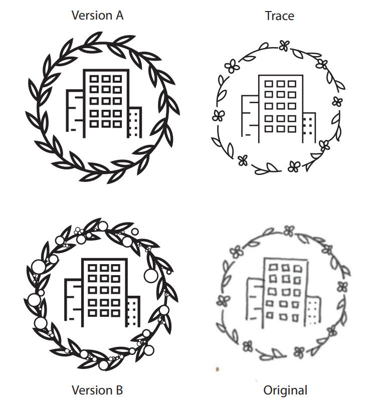
Iterations of logo design from draft to final vectorization.
I then created a logo for the company on paper and vectorized it with Adobe Illustrator.
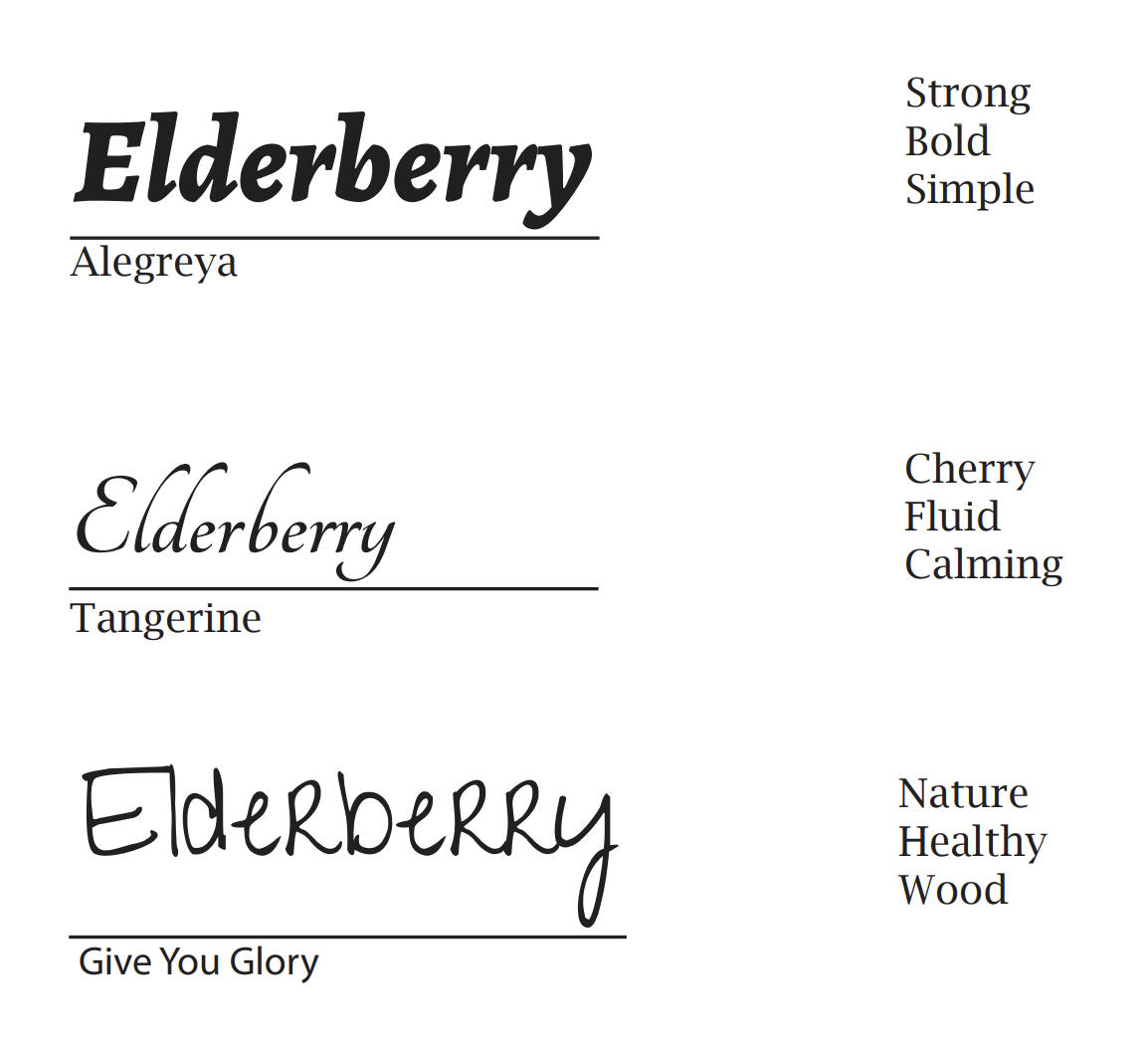
Logotype explorations.
Afterwards, I explored different logotypes for the brand, then designed a completed logo featuring the graphical logo and the logotype.
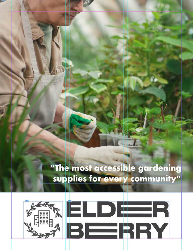
Brochure front page design for Elder Berry
During the project, I also explored web and brochure layouts, branding applications, letterheads, and business card design.

Business card front
Business card back

Letterhead
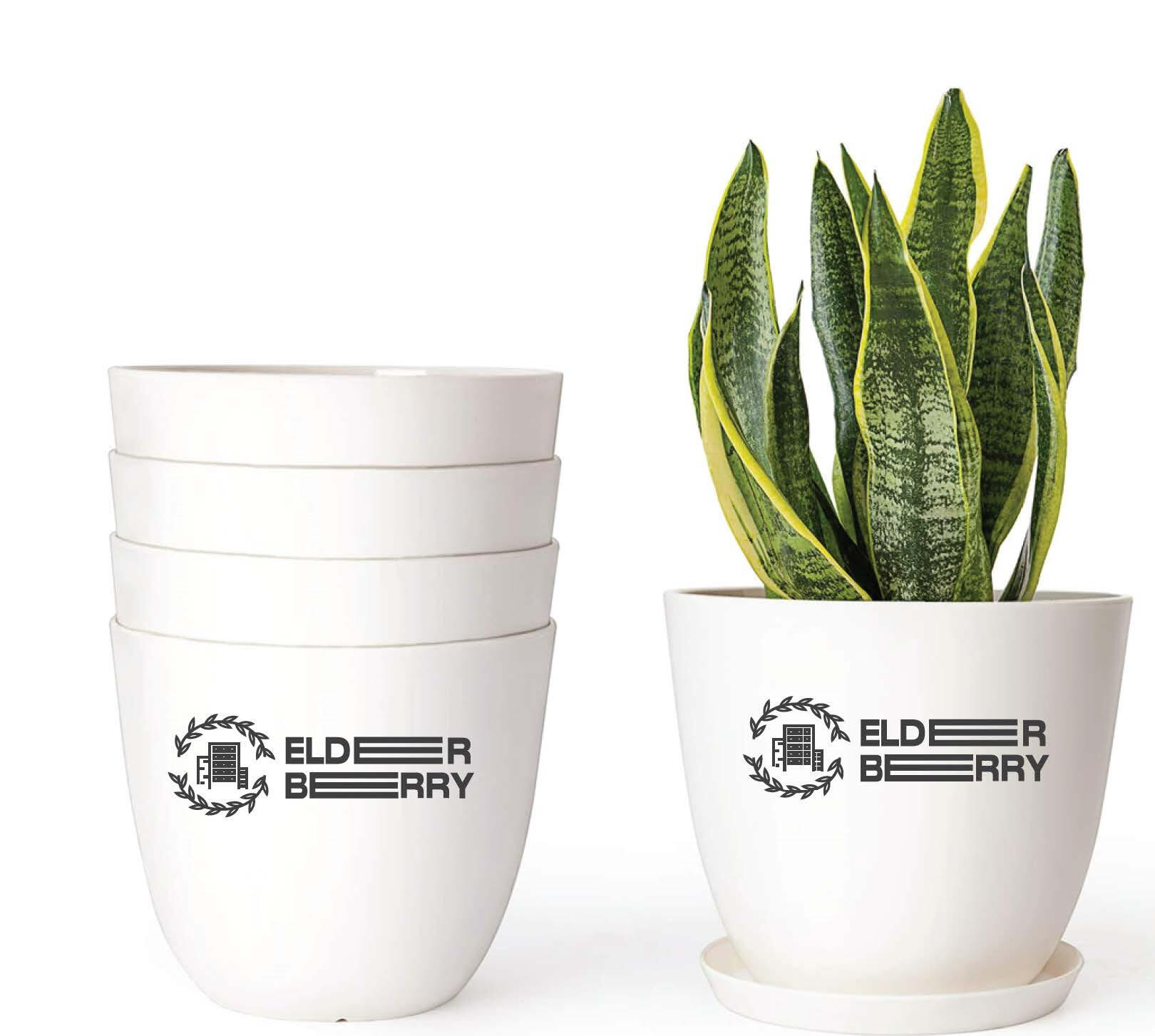
Branding application
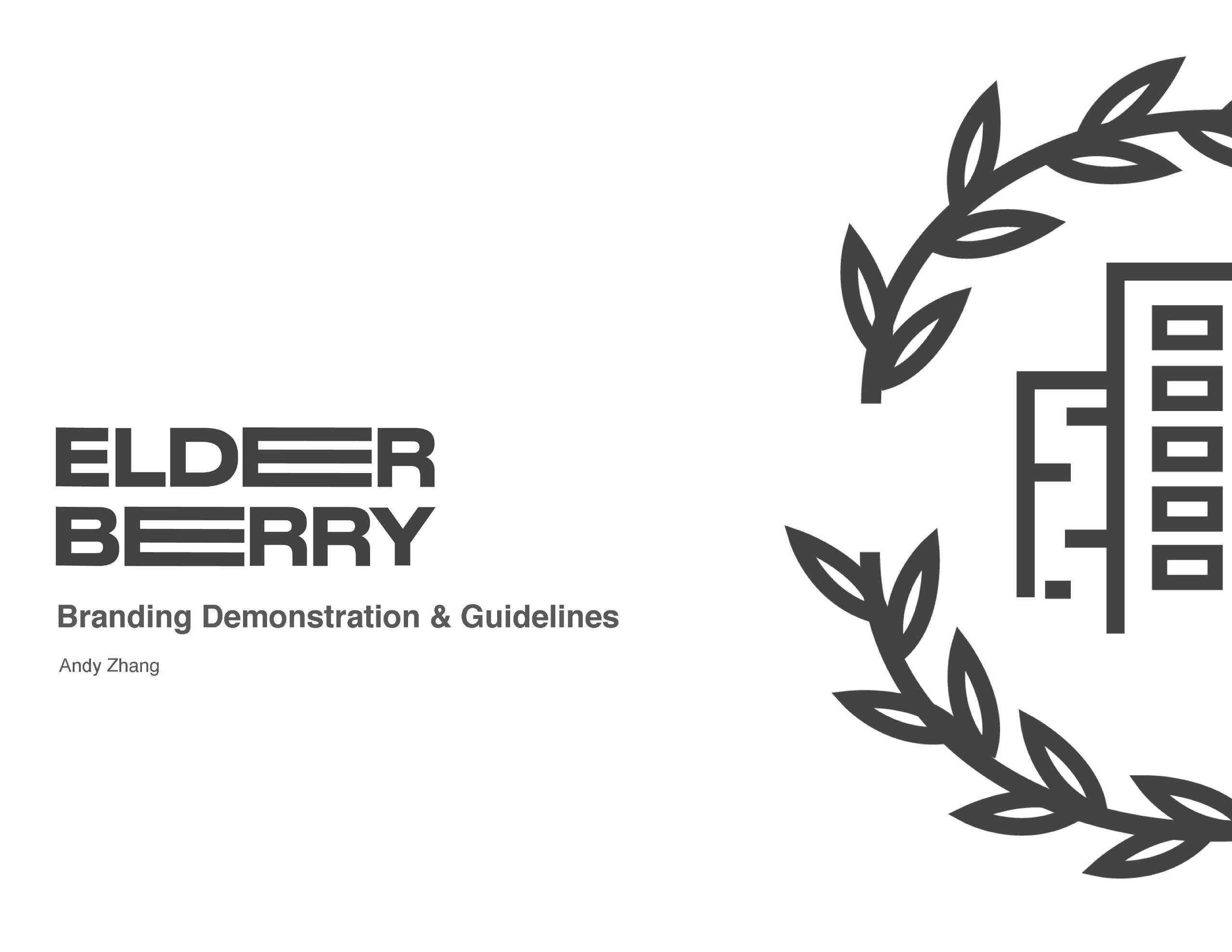
Elder Berry branding guideline
Finally, I compiled all my work into a branding book, which follows a consistent branding guideline.You can find the brand book here.
Conclusion
I think my biggest challenge with this project was maintaining the balance between design and function. As an artist, I often strive for visually complex artwork, but when it came to branding design, I spent a long time seeking the perfect balance between simplicity and functionality. By using colour, typography, and informational elements, I was able to create a brand book that I am proud of.